How to style an Angular Material table
Angular Material is a popular UI library for building Angular apps.
But sometimes we might want to style the Angular Material components to match our design guidelines or style.
For example, we might want to style the Angular Input component to look different then the standard option.
Today we're going to learn how to customize the style of the Angular Material table component.
It's actually quite easy once you understand how to do it.
Using the Angular Material root variables
One of the basic concepts we need to understand when styling the Angular Material table component is that we can use CSS variables to set it's styles.
This is done using the root CSS option.
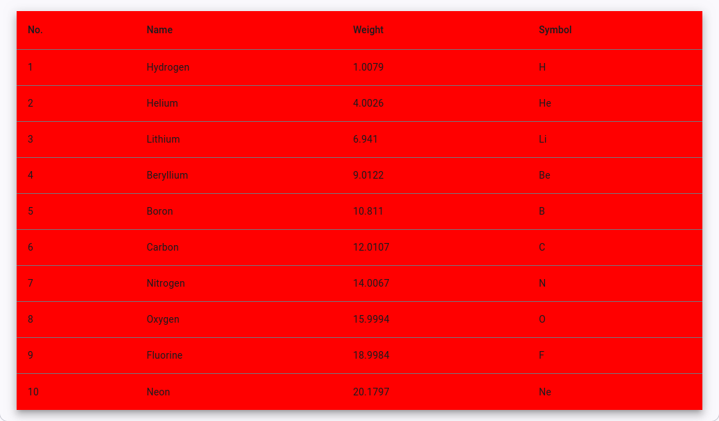
For example, if we wanted to set the background color of the Angular Material table we can declare that by simply setting a root variable.
:root {
    --mat-table-background-color: red;
}
And our table will now look like this.

So, what are the root variables that we can adjust to custom style an Angular Material table?
Global CSS properties for Angular Material tables
Here’s a list of the available global CSS custom properties (root variables) for Angular Material tables (mat-table).
These variables are defined in Angular Material to allow customization of various table elements:
-
Table Container Styles:
--mat-table-header-background-color: Background color of the table header.--mat-table-header-color: Text color for the table header.--mat-table-row-background-color: Background color for the table rows.--mat-table-row-hover-background-color: Background color when hovering over table rows.--mat-table-row-color: Text color for the table rows.--mat-table-sticky-header-background: Background color for sticky headers.--mat-table-sticky-footer-background: Background color for sticky footers.--mat-table-sticky-z-index: Z-index value for sticky elements.
-
Column Styles:
--mat-column-padding: Padding for table columns.--mat-column-min-width: Minimum width of table columns.--mat-column-border-color: Border color for table columns.
-
Cell Styles:
--mat-cell-padding: Padding for table cells.--mat-cell-font-size: Font size for the table cells.--mat-cell-color: Text color for the table cells.
-
Pagination Styles (if used with
mat-paginator):--mat-paginator-background-color: Background color for the paginator.--mat-paginator-color: Text color for the paginator controls.
And that, my friend, is how to style an Angular Material table.
Angular + Material = 🥰

Daniel Kreider
