
How to add a loading spinner to an Angular Material button (Step-by-step Guide)
Say, wouldn't it be dandy if the Angular Material button had a loading spinner option?
This is the complete guide that will teach you how to add a loading spinner to the Angular Material Button
Um...
...wouldn't it be just dandy if the Angular Material library had a button with a loading spinner?
Like maybe a CSS class or attribute that we could toggle?
Something we could flip to put our Angular material button into a loading state?
Turns out, there are a couple ways we could do this. And it's really not that hard.
Let's get started, shall we?
Use the ngx-loading-buttons library
This project is a lightweight Angular library specifically created to add a loading spinner to your Angular Material buttons.

The first step is to install it, like this.
ng add ngx-loading-buttonsThis will download the library and also add a small CSS file to your angular.json file.
Next, you'll need to import the NgxPagememoryModule into your app.module.ts file. Here's an example.
import { NgModule } from '@angular/core';
import { BrowserModule } from '@angular/platform-browser';
import { NgxLoadingButtonsModule } from 'ngx-loading-buttons';

import { AppComponent } from './app.component';

@NgModule({
  declarations: [
    AppComponent
  ],
  imports: [
    BrowserModule,
    NgxLoadingButtonsModule,
  ],
  providers: [],
  bootstrap: [AppComponent]
})
export class AppModule { }
And last of all, add it to your <button> element like this.
<button mat-raised-button [mtBasicSpinner]="true">Click Me</button>You can also hide a button's text when the spinner is activated with the hideText property.
<button mat-raised-button [mtBasicSpinner]="true" [hideText]="true">Click Me</button>Create our own solution
But what if you'd rather avoid another dependency?
Then here's how to add a loading spinner to an Angular Material button without using a library.
It begins with some CSS.
@keyframes spinner {
  to {transform: rotate(360deg);}
}

.spinner:before {
  content: '';
  box-sizing: border-box;
  position: absolute;
  top: 50%;
  left: 50%;
  width: 20px;
  height: 20px;
  margin-top: -10px;
  margin-left: -10px;
  border-radius: 50%;
  border: 2px solid #ffffff;
  border-top-color: #000000;
  animation: spinner .8s linear infinite;
}
In my case, this CSS would be placed inside of my component's CSS file.
Next, we have our component's HTML file.
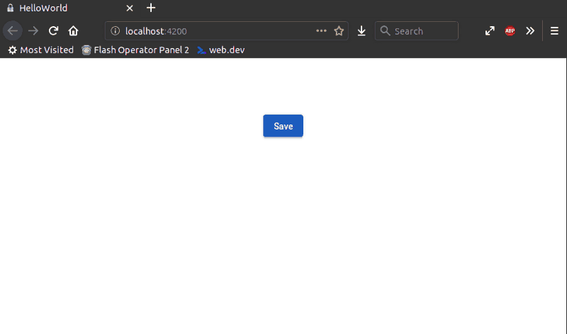
<div style="text-align:center">
  <button mat-raised-button color="primary" [class.spinner]="loading" [disabled]="loading" (click)="save()">Save</button>
</div>
And last of all, our component's Typescript file.
export class AppComponent{
  title = 'hello-world';
  loading = false;

  save(): void {
    this.loading = true;
    // do your saving thing here
  }
}
Done!

Simple?
I told you. You're welcome. Hope you enjoyed it.
Conclusion: Time to spin a comment
What do you think about this approach to adding a loading spinner to an Angular Material button?
Is there a better way?
Let me know in the comments below.

Angular Consultant
P.S. - If you're a skimmer like me than here's what this article is about.
- The no-hassle way to add a loading spinner to your Angular Material buttons... in less than 2 minutes.
- How to add a loading spinner to your Angular Material buttons without installing new dependencies.
- How the brand-new ngx-loading-buttons library can make your life as an Angular dev easier. 🎉 🎉 🎉
P.P.S. If you found this article useful please smash one of the reactions below. 👇