Angular Material Dark Theme Guide For Beginners (With Code Examples)
Want to learn how to create a dark Angular Material theme?
In this post I'm going to show you how to create a dark theme for your Angular Material app.
Why?
Because any Angular Material app that isn't using a custom theme is kinda behind times, right?
Every professional website or web app has it's own custom theme, or better yet, multiple themes.
Why, even the official docs have 4 different themes that you can choose from.
So, let's learn how to build a custom dark theme for our own Angular Material app.
Table of Contents
- Creating the Angular project
- Installing Angular Material
- Creating the dark Angular Material theme
- Next Steps

1. Creating the Project
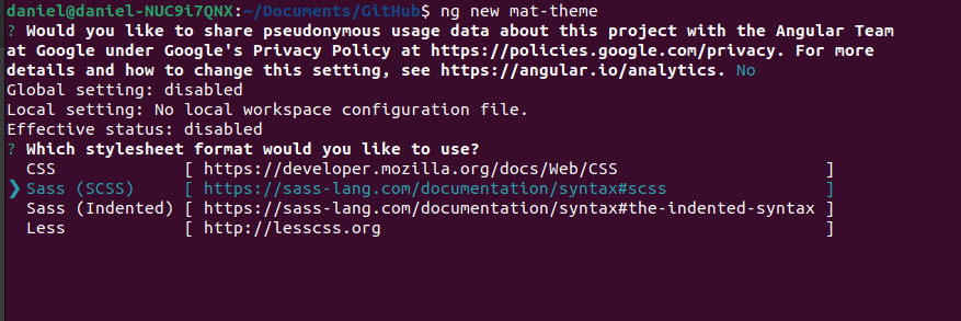
We're going to use the Angular CLI to create a demo app.
ng new mat-themeYou'll be prompted to choose what type of stylesheet format you want to use.
Choose the Sass (SCSS) option.

You will also be asked if you want to enable Server-Side Rendering (SSR) and Static Site Generation (SSG/Prerendering)?
The answer to this is generally no, but it doesn't matter.
Now our app is ready for the next step.
2. Installing Angular Material
Next step is to install Angular Material using the Angular CLI schematics.
We will cd into the root directory of our app.
cd mat-themeAnd install Angular Material.
ng add @angular/materialWhen asked if you want to proceed type Y and hit Enter.
The installation of Angular Material will then begin.
Next, you should be prompted as to what type of prebuilt theme you want to use.
Since we will be building our own beautiful Angular Material dark theme we won't use any of the prebuilt ones.
Select the Custom option and hit Enter.

You will also be asked if you want to Set up global Angular Material typography styles? and if you want to Include and enable animations.
Choose the yes option for both of these.
That's it my Angular friend.
Our setup is done and now you're ready to build the dark theme!
3. Creating the dark Angular Material theme
When creating Angular Material themes we work with... colors.
There are 3 types of colors.
- primary
- accent
- warn
These colors are generally the primary and secondary colors of your brand palette.
The primary color is the color displayed most frequently across our Angular web app.
And the secondary color is a way to provide a bit more of an accent.
So, we're going to open the styles.scss file and define our 3 colors. For other color options you can take a look at the 2014 Material Design color palette.
Remove everything from the styles.scss file and replace it with this.
@use '@angular/material' as mat;

@include mat.core();

$dark-primary: mat.define-palette(mat.$blue-palette, 900);
$dark-accent: mat.define-palette(mat.$grey-palette, 800);
$dark-warn: mat.define-palette(mat.$red-palette, 700);
Next, we're going to define our dark theme.
$dark-theme: mat.define-dark-theme((
  color: (
    theme-type: dark,
    primary: $dark-primary,
    accent: $dark-accent,
    warn: $dark-warn,
  ),
  typography: mat.define-typography-config(),
  density: 0
));
And last of all, we're going to use it. Or in other words, apply this theme to our Angular app.
@include mat.all-component-themes($dark-theme);And bingo, you've just created a dark Angular Material theme.
Next Steps
If you want to learn even more about Angular Material themes then check out my new training Create Stunning Themes With Angular Material.
It takes less than 30 minutes to complete and equips you with:
- Angular Material Theme Basics: Understand how Material theming, colors and variables actually work so that you can create any type of theme your boss asks of you.
- Dark & Light Theme Mastery: Learn how to create professional dark and light themes that adapt seamlessly to user preferences.
- Theme Switcher Implementation: Discover how to build a user-friendly theme switcher, allowing users to effortlessly change the app's appearance.
- Custom Color Themes: Empower users with the ability to personalize their experience by creating themes with custom color palettes.
- Bonus Lesson: Build a yellow punk theme.
You can learn more about it here.
Till later, Daniel

